Expressing the true value of an investment and property partner.
For over ten years, Quadriga have been helping automotive retailers in the UK realise the value of the property portfolio, either by providing investment support or purchasing property to enable relocations and redevelopment.
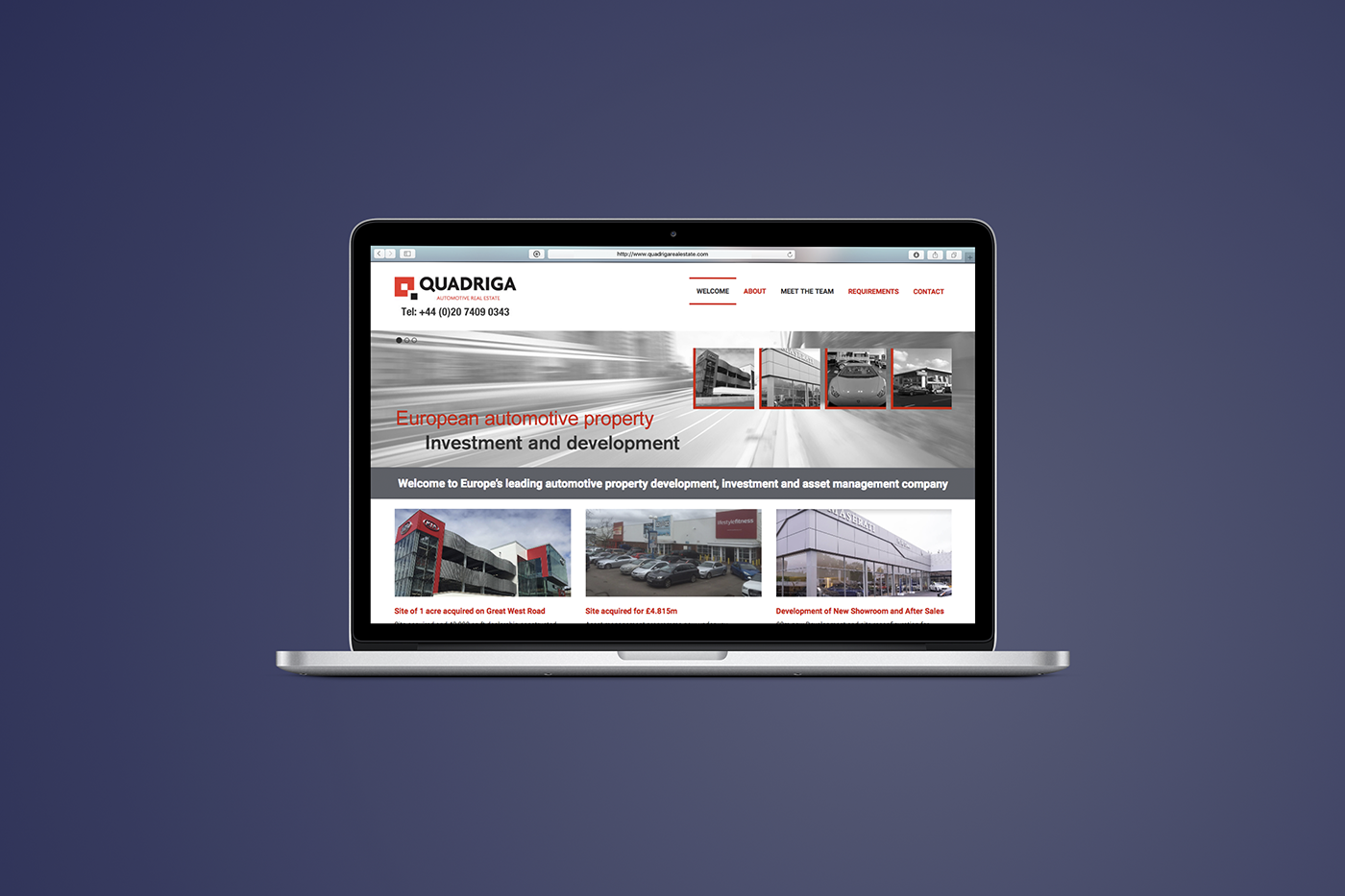
We approached them with a view to expressing that offer from the rather generic online presentation, towards a new look and feel that captured the true investment clout and professionalism of the business - and to give greater confidence to prospective clients about those qualities in the first instance.
While the Quadriga logotype remained unchanged, everything else about the new visual language was begun from scratch.
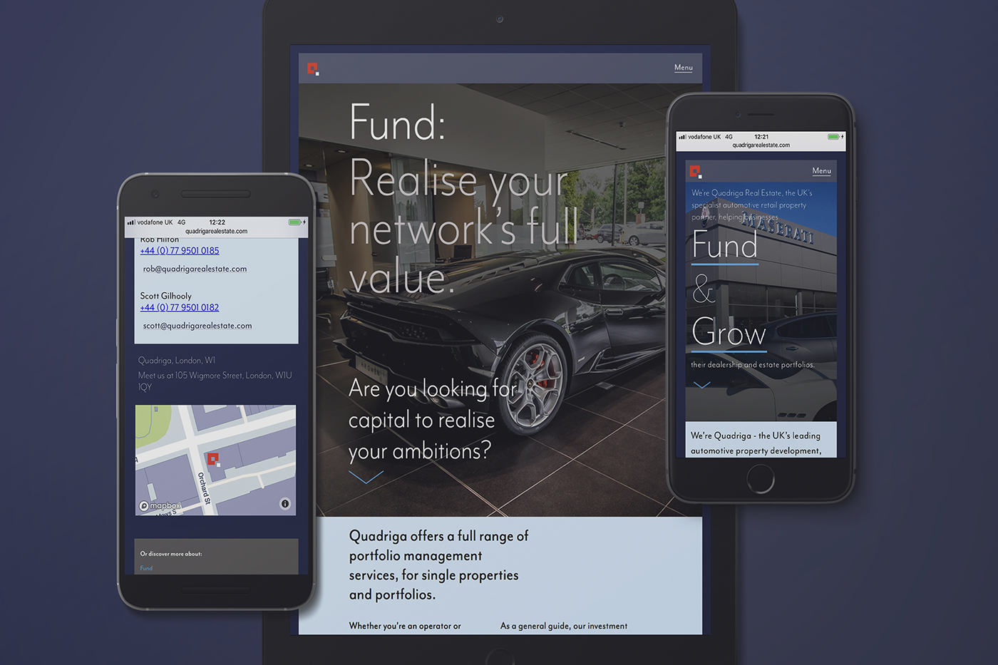
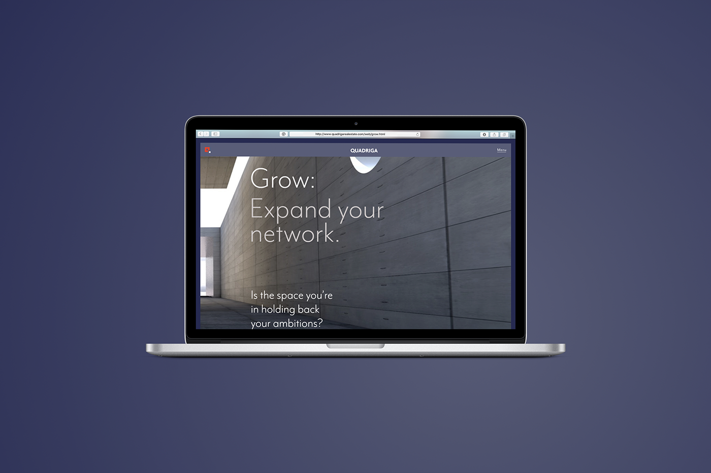
The new colour palette and font family was designed to frame a selection of sourced and commissioned hero images supporting a re-organised series of pages to unfold the Quadriga offer.
Most importantly was our proposal to re-present the principle offers (of capital investment or new property) under the cut-through ’Fund & Grow’ banner - making this bold and clear right from the start. All the current copy was also revised and sharpened up in the design programme.
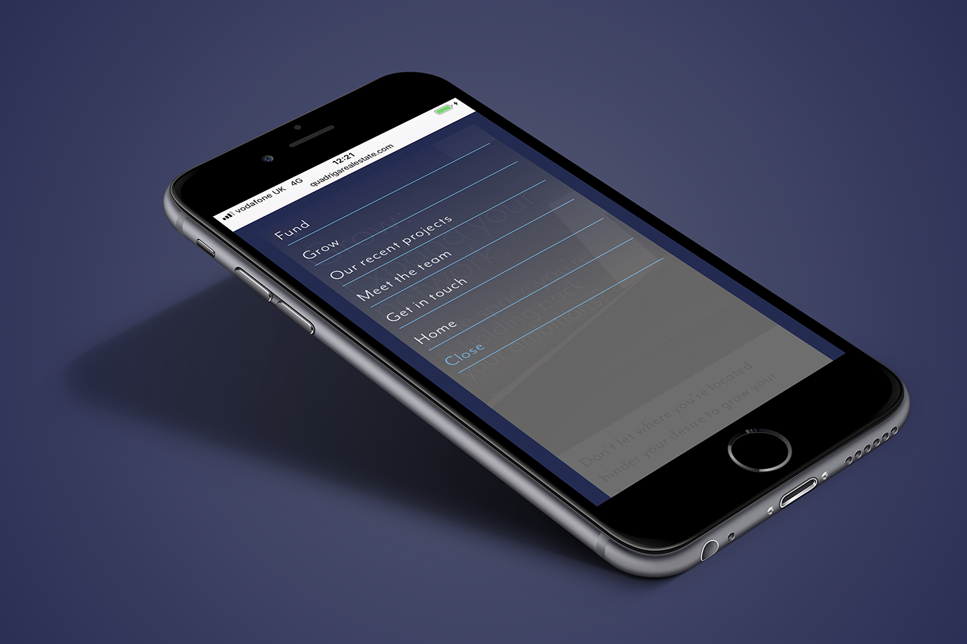
Once the UX design was agreed, we built the site, tested and then handed the codebase over to the incumbent hosts.
Quadriga Real Estate

Here's just a small selection of images from the project. For more information and a full case study, please drop Richard Atkinson an email.


info@experiencemeda.com

