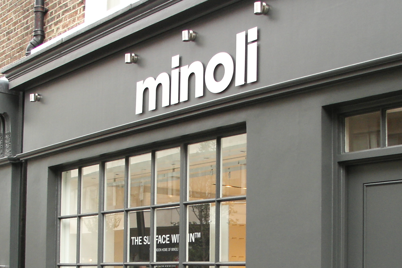
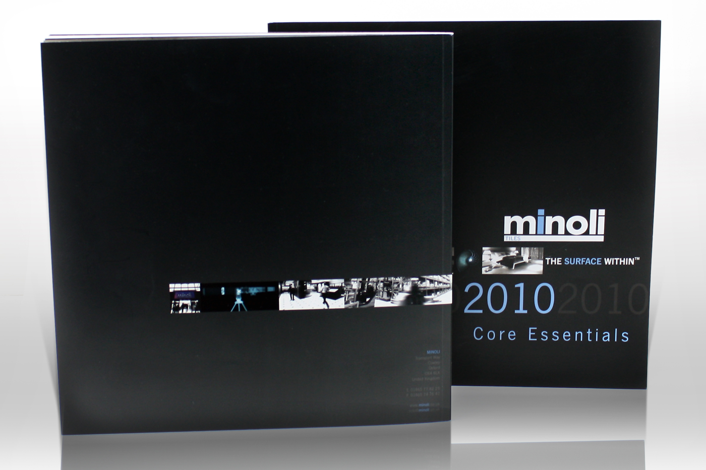
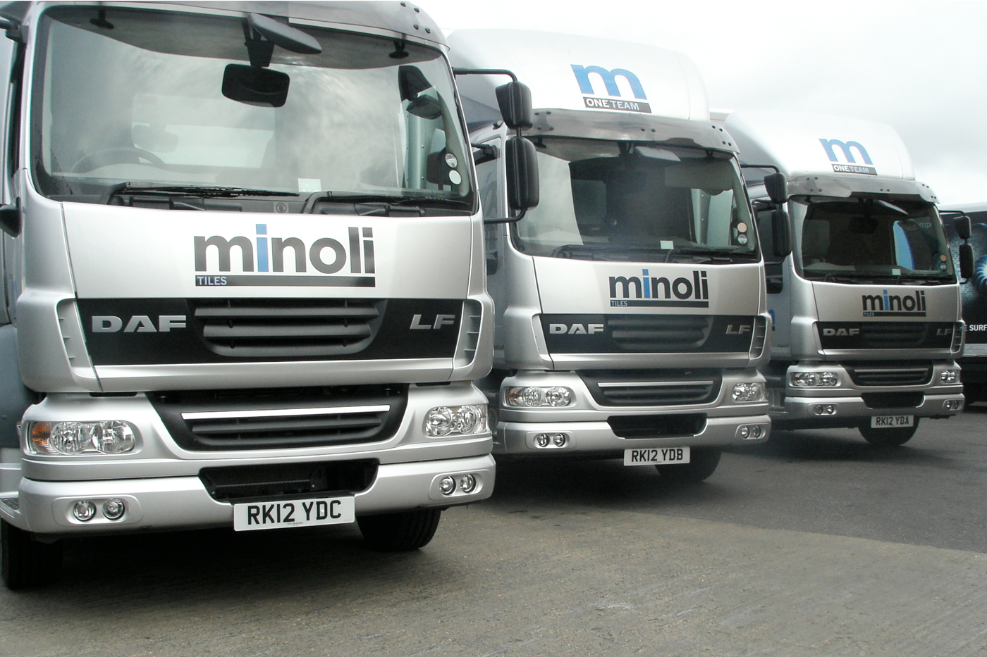
Projecting the story of ‘the surface within’.
Faced with increased competition from established and new market entrants, Minoli felt it was high time they reviewed their long-standing identity.
The Minoli logotype, customer facing materials and vehicle livery dated back to the 60’s and now needed to be adapted to demonstrate the company’s leading service standards, innovative product range and unbeatable logistics.
We undertook a full-scale review of the company’s environment, positioning and direct/indirect competitor sets, along with in-depth interviews with the Minoli Team. The insights gathered generated a ‘value-chain’ portrayed the company’s excellent standing, both with upstream manufacturers and downstream corporate/private clients.
Working closely with the Minoli team, we developed the new brand identity, visual language, brand signature ‘The Surface Within’ and the headline key message of ‘Be Inspired’.
With a new corporate identity and visual language (based on revealing the beauty of tiles within X-rayed organic objects), comprehensive brand guidelines and example applications were developed across a range of materials so as to provide Minoli’s in-house team with a permanent reference.
“Our refreshed corporate identity has not only re-invigorated the company, but has also significantly contributed to our recent success and two back-to-back record years.”
Jonathon Minoli, Managing Director
Minoli Tiles

Here's just a small selection of images from the project. For more information and a full case study, please drop Richard Atkinson an email.


info@experiencemeda.com

